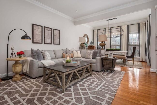
5 Designer-Favorite Gray Paint Shades Revealed
Unveiling the top gray paint shades adored by interior designers reveals a palette that can transform any space with sophistication and versatility.
Each shade offers a unique ambiance, from soft, soothing tones to bold, dramatic hues, providing options that can complement any decor style.
Gray paint is celebrated for its ability to provide a neutral backdrop that highlights other design elements.
Discover the top 5 gray shades that have captured the admiration of designers and could enhance your home's aesthetic.
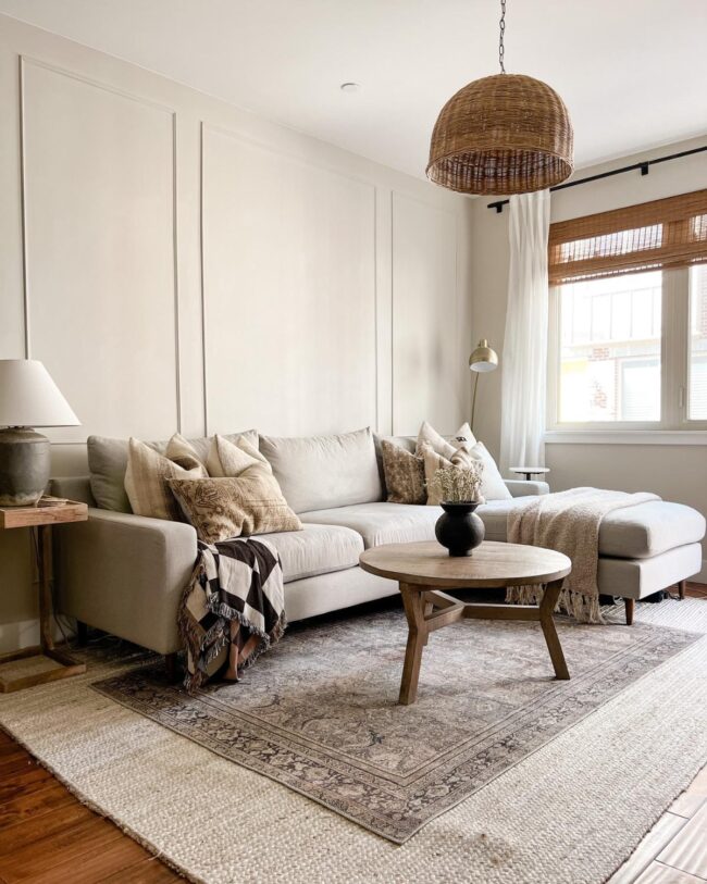
Sherwin Williams’ Agreeable Gray
Agreeable gray captures attention with its unique blend of warmth and sophistication, making it a favorite among interior designers.
This versatile shade features subtle green undertones and reflects light beautifully with an LRV of 63, creating inviting spaces without overwhelming the senses.
Perfectly balancing between gray and beige, it complements various design styles seamlessly while enhancing natural wood tones.
Whether in bright or dim settings, this color transforms your environment into a cozy retreat that feels effortlessly stylish.
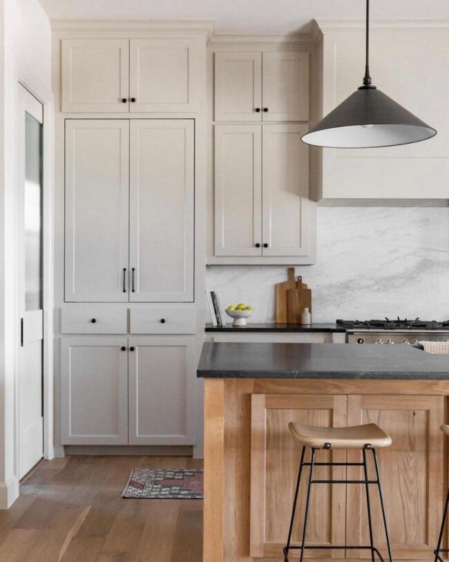
Benjamin Moore’s Revere Pewter
Revere Pewter is a sought-after gray paint choice favored by many interior designers. Its depth adds warmth to spaces, making it an appealing option for various rooms.
The subtle green undertone provides versatility, allowing it to complement darker wood elements beautifully. While once popular for expansive living areas, this shade now shines in smaller settings like offices and cabinetry, proving its adaptability across different styles and preferences.
If you're looking for a timeless hue that balances modernity with comfort, Revere Pewter may just be the perfect fit for your next project.
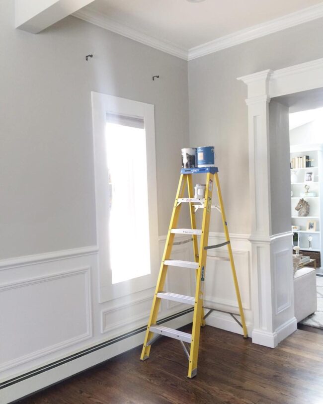
Sherwin Williams’ Repose Gray
Repose Gray ranks among the most sought-after gray shades for interior design, celebrated for its versatility across various styles.
With subtle blue undertones, it offers a refreshing twist without overwhelming intensity.
Placing this hue in south or west-facing spaces creates a warm and airy atmosphere, while north-facing rooms allow those cool tones to shine through beautifully.
Embrace Repose Gray as your go-to choice for adding sophistication and depth to any setting you envision.
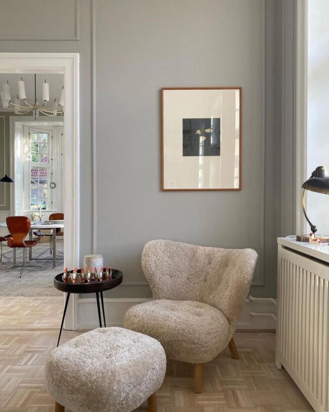
Farrow & Ball’s Pavilion Gray
Pavilion Gray from Farrow & Ball stands as a versatile choice that many interior designers cherish.
This shade draws inspiration from the refined colors of 18th-century Sweden, offering a sophisticated balance between warmth and coolness.
It works beautifully in various settings, effortlessly blending with both modern and classic decor styles.
Benjamin Moore’s Classic Gray
Classic gray emerges as a sought-after choice among interior designers, celebrated for its light and warm hues.
This shade offers an airy feel reminiscent of white while avoiding the heaviness of darker grays, making it suitable for those hesitant to embrace bolder tones.
Its subtle blue-gray undertone can bring life to north-facing rooms or areas lacking sunlight.
When considering this color, assessing how it interacts with your existing elements and decor is essential; testing samples will help you visualize its true impact in your space.

